 Spring 2017
 Principal Components Analysis
Due Monday 3 April 2017
The goal of this week's lab is to add the capability to execute PCA on a data set and then create plots based on the analysis.
Tasks
- In your GUI, enable the user to pick a data file, execute a PCA analysis, store the result, and then create an entry in a listbox that links to the result. The basic capability should allow the user to pick and choose which columns of the original data to use in the PCA analysis. Each new analysis should show up as a new entry in the analysis list box. Allow the user to delete an existing analysis.
- In your GUI, enable the user to select an analysis from the listbox and view the data projected onto the first three eigenvectors. An extension is to allow the user to pick the columns to plot.
-
In your GUI, somehow enable the user to see the eigenvectors and
eigenvalues of a selected PCA analysis. For example, show them in a
dialog window as a table.
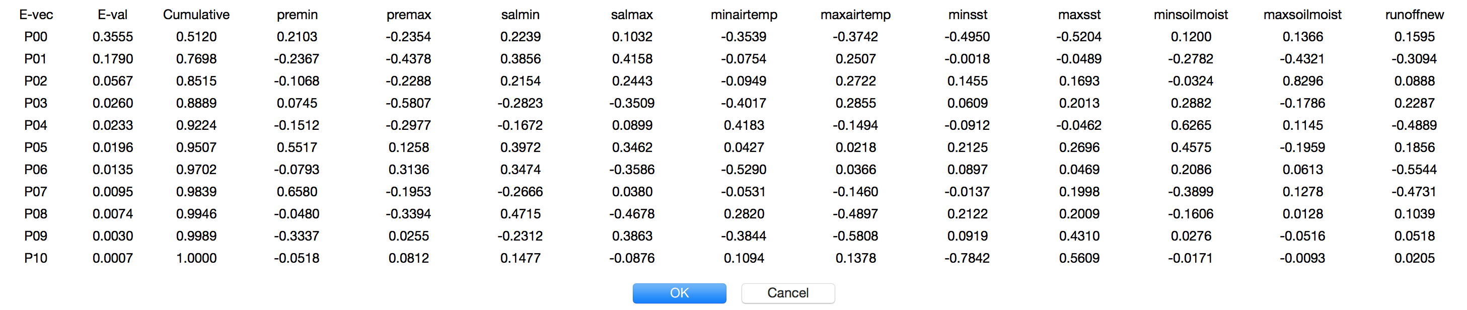
You probably want to use the tkinter grid layout method in order to build the table.
Note the second and third columns, which show the eigenvalues and the cumulative percentage of the eigenvalues from largest to smallest. In this case, the first five eigenvectors explain 92% of the variation in the data set.
-
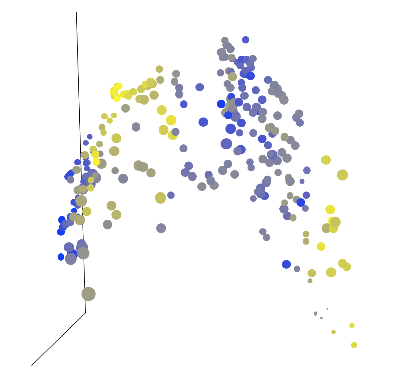
Using the Australia Coast data set,
compute the PCA analysis on the columns: premin, premax, salmin,
salmax, minairtemp, maxairtemp, minsst, maxsst, minsoilmoist,
maxsoilmoist, and runoffnew. Then show a spatial plot of the data
projected onto the first three eigenvectors. The plot should look
something like the following.
- Come up with an acronym or name for your program. Be creative. The success of your program may, in the end, be completely determined by how cool your acronym is. Then again, it's success may have something to do with the quality of your work. But it never hurts to have a cool name.
Extensions
- Enable reading and writing the PCA data an analysis as a CSV file. You will need to somehow store the eigenvectors, eigenvalues, and column averages along with the projected data. Note that there should be as many eigenvectors, eigenvalues, and means as there are columns of data.
- Add other features, like the ability to name an analysis.
- Enable the user to select up to five columns from the PCA analysis to plot (x, y, z, color, size).
- Enable the user to select up to five columns, intermixed from the original data and the PCA analysis to plot. For example, try plotting the Australia Coast data using Latitude and Longitude for the x and y spatial axes, then using the projections onto the first two eigenvectors for color and size.
- Demonstrate your system on your own data set. How many significant dimensions are in your data set?
Writeup
Make a wiki page for the project report.
- Write a brief summary of your project that describes the purpose, the task, and your solution to it. The summary should be 200 words or less.
- Write a brief description of how you implemented the PCA algorithm and modified your Data and Display/Application classes.
- Incorporate screen shots showing a visualization of the Australia Coast data set into your report. Focus integrating the text and figures.
- Be sure to document and describe any extensions.
- Summarize what you learned and identify any collaborators/assistance.
Handin
Once you have written up your assignment, give the page the label:
cs251s17project6
Put your code your private handin directory on Courses. Please make sure you are organizing your code by project in the Private subdirectory.